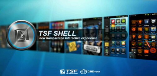
Before we move forward with this review, let’s go backwards a bit in time to about the middle of December 2011. TSF launched a YouTube video that was immediately showcased by all the major tech blogs. It made quite a splash showing off incredibly smooth transitions, an innovative dockbar, flaming icons, and much more running on old hardware. By old I mean it was running on a device with a single core device with half the RAM that was considered a standard. You can see the YouTube video here.
Needless to say, I was wowed, stunned, in complete awe by what I witnessed. I experienced what many geeks affectionately refer to as “techno-lust”. I needed it. And I wanted it right then. Well, that didn’t happen, and we had to wait.
And wait.
And wait.
And finally news came that it would be released, and that it would come with a price tag of $16.80 US currency. You read that correctly. $16.80. That immediately placed it as the highest priced launcher replacement app in the Play Store, above even the likes of SPB Shell 3D which, as of this writing is exactly $14.95 USD.
The biggest question surrounding this app is: Is it worth it?
That is what I aim to find out. I have spent approximately the last 10 days with TSF Shell 3D and I do believe that is long enough to be able to give an accurate review of this launcher. I will list out its pros, it’s cons, go as in depth as I can, and show you why you should be interested in what TSFUI has to offer.
TSF Shell 3D is unlike any launcher I’ve ever used. It kind of rewrites the rule of how launchers can operate. They change things from free floating app shortcuts to gliding through your homescreens instead of scrolling through them.
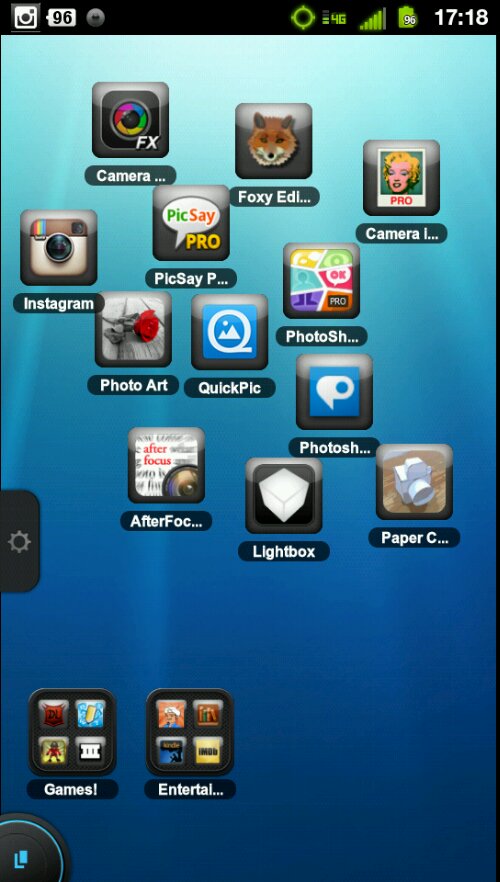 Take note that I said glide through your screens, because if you try to scroll through you’re home screens nothing will happen! Instead there is a persistent toggle down in the bottom right corner that looks much like a card on top of another card surrounded by two thirds of a cyan blue circle.
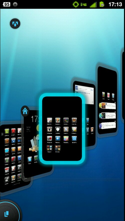 If you press that you are brought to the home screen changer and you can glide your finger from left to right to select the Homescreen you want. It’s a change of pace from almost everything you know, but it’s a welcome one. I found gliding through my home screens to be much more accurate and much faster than swiping through them. Especially when going from page 1 to page 8. It’s fast than a helicopter view, it’s fast than scrolling. It just works.
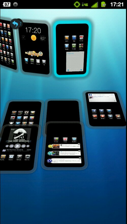
Rearranging your screens or adding new ones is also very simple. You just press the Homescreen button and the Press the three card button that appear in the top right of the screen. You will be presented with all your homescreens and you will be able to move them in an out of order by long pressing them and dragging them around. You are also presented with a blank area where you can drag and leave a homescreen until you know what you want to do with it. Getting rid of a Homescreen is as simple as dragging it to the trash can.

 You are able to move more than one application at a time by either double tapping as many icons as you want and them holding one down, or by gliding your finger around a Homescreen to create a lasso like you’d find in older versions of Windows. This type of functionality is very welcome.
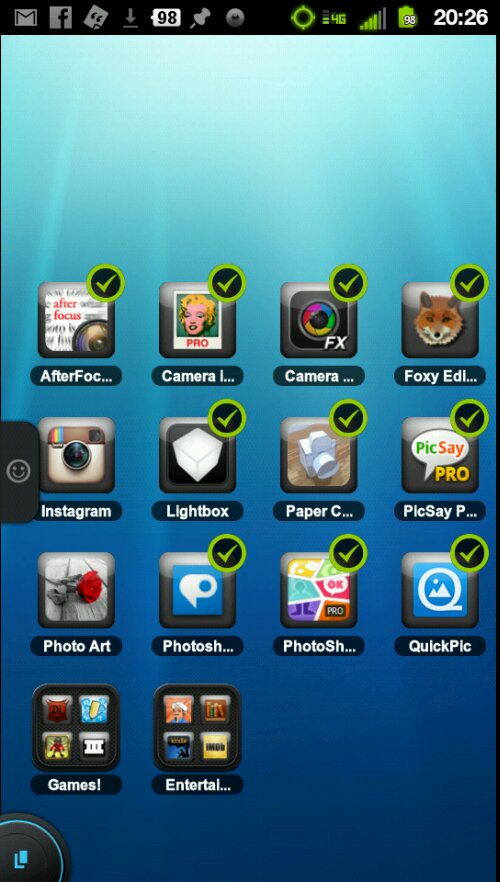
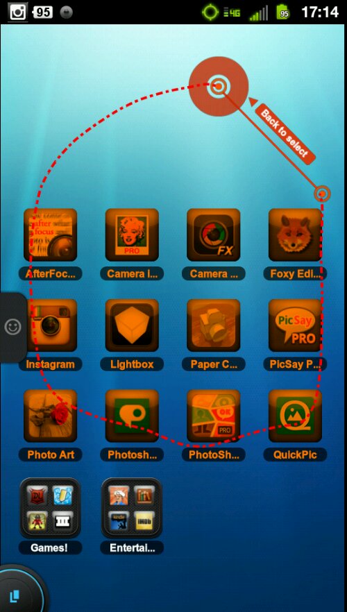 It also introduces folders. This is particularly useful to people still on Gingerbread as folder support doesn’t come natively to Android until 4.0.x Ice Cream Sandwich builds.
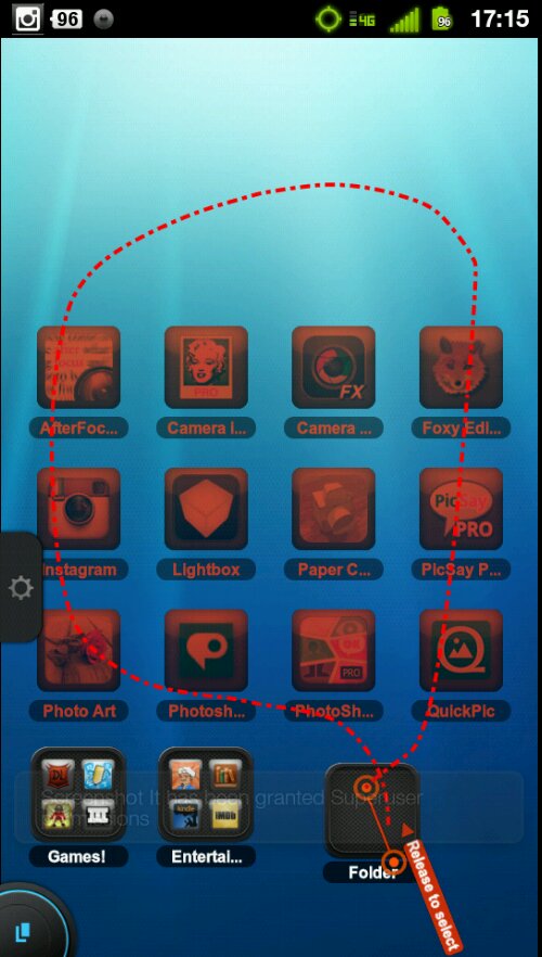
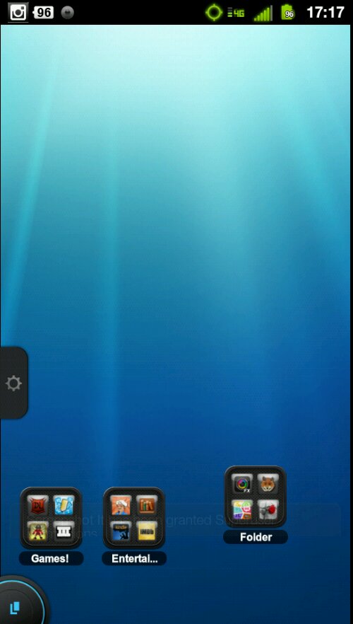
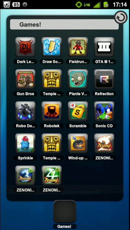 So aside from the standard dragging apps into the folder, being able to rearrange apps inside the folder, and naming the folder (still waiting for an auto name feature like in iOS) TSF Shell distinguishes itself by giving you two extra ways to interact with a folder. If you place your folder on a Homescreen with a bunch of floating apps and you want to put them all inside the folder you can rope them in using the lasso gesture. Simply start drawing a lasso from the folder around the apps you want to be in the folder, and then end the lasso back at the folder. All the apps will scurry on inside it.
 The other neat thing you can do is to show the contents of a folder by dragging them out from the folder. Simply place your finger over the folder and swipe away and watch as a trail of apps follows your finger around the screen. It’s quite amusing, though I’m not sure about the practical value of it.
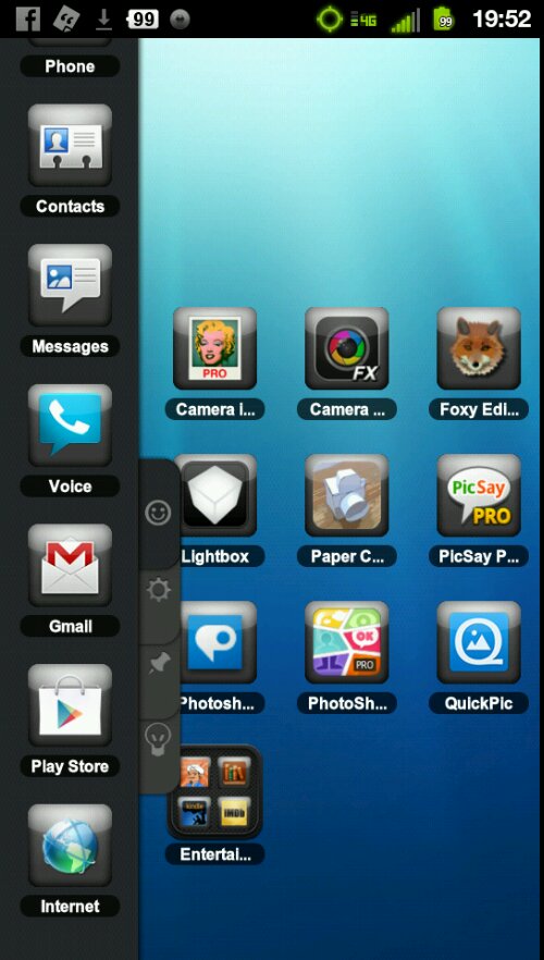
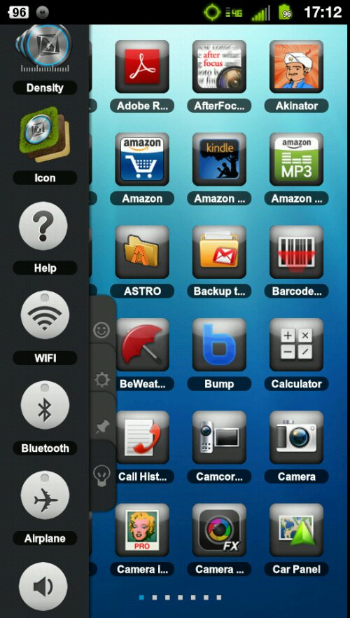
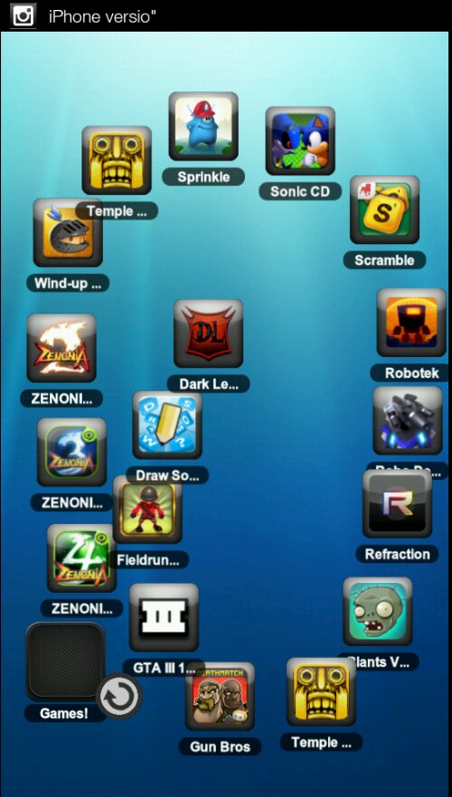 You may also notice, looking at shots of the home screen that the standard dock is gone. It is instead replaced by a dockbar that is fully customizable and resides on the left side of the screen. You pull it out by pulling the tab.
 Then you are presented with 4 tabs which you slide through or tap through. The Smiley tab is your traditional custom dock. Place whatever shortcuts you want quick access to and you will always have them.
 The Gear Tab belongs to TSF Shell Widgets and also contains Contact shortcuts and folders as well.
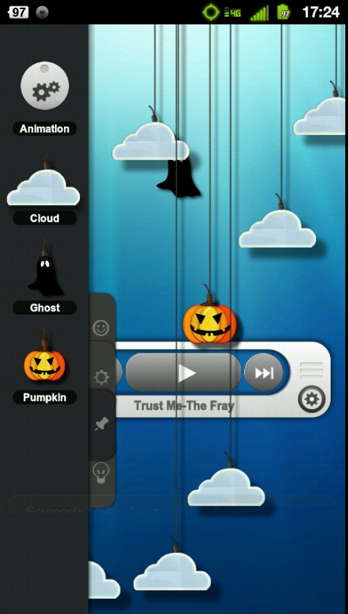
 The Pin Tab to TSF Shell decorations.
 The LightBulb Tab belongs to quick access controls like Airplane Mode Toggles, a density changer, and an icon customizer.
 So, the Pros:
1st) Its fast!!!! That is one thing that TSFUI has done extremely well. They gave this launcher a shot nitrous oxide into its coding. I CANNOT slow it down. Despite its incredibly fancy effluent 3D transitions at every turn this launcher has yet to even slow down on me. When they gave the video for this back last year, that’s one of the things that everyone noticed. How fluid it was. In fact many were led to believe that we were seeing not an actual demonstration but were instead being victims of what many game makers do: A pre-rendered and scripted video. The claims were quickly refuted and then rebutted with the claim that the launcher was being demonstrated on a Desire HD. Now, even back then the Desire was yesterday’s hardware. Yet the video showed it running smoothly without a hitch. And that remains true today. Fast. Fast. Fast.
2nd) It’s stable. Aside from not having slowed down on me, it’s also never crashed or reloaded (some custom UI launchers *cough cough SENSE cough* have a tendency to do that when multitasking or doing something processor intensive). In fact, I would go out on a limb and say that, of the half dozen or so launchers I’ve used in my time, never once have had a launcher NOT crash me. So it’s a pleasant surprise.
3rd) It’s beautiful. Let me state that again. Beautiful. The only other launchers on the market or on a device that I have personally witnessed that has ever screamed “polish” and “beauty” like this one does are SPB Shell and the MIUI lanucher. Say what you will about Metro UI replicas, or the new ICS “Holodeck” (as I’ve taken to calling it), or Sense, or Motorola’s not Blur, or Touchwiz. They simply do not come close to this. Even swiping through apps in the app drawer is beautiful due to transitions.
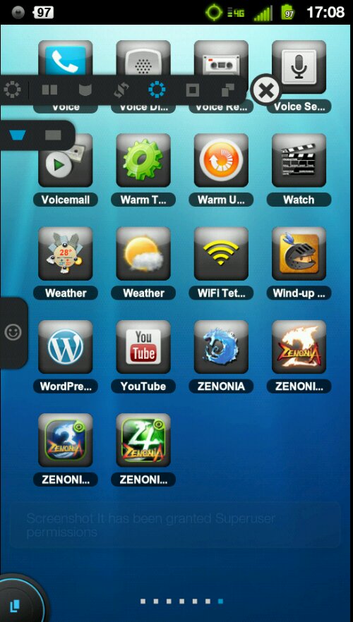
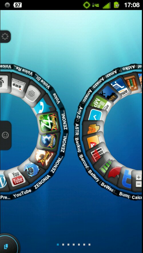
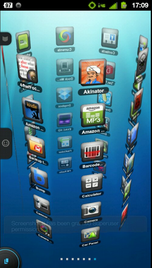 One of the things that we love about Android is making it LOOK the way we want. HTC went out of their way not too long talking about making the phone “You” and introducing skins and scenes to their phones. Well, pull out your phone running this launcher and the person looking will know that you’ve definitely got something different. It simply looks striking. In fact I would say that it even edges out above SPB in terms of looks alone based on the fact that you can theme it. And that leads me into Pro #4.
4th) You can customize this launcher in more ways than I’ve ever seen. I will say that this is the first launcher replacement app I’ve used that allows me to place apps where ever I want them. That may seem strange at first but what I mean by that is this: Traditionally Android Homescreens array themselves in 4×4 or 5×4 grids depending on the resolution of the device you’re using or the launcher you’re using. So if I wanted to fill up a screen with a bunch of apps I could have at most (on a 4×4 grid) 16 apps. TSF Shell 3D does away with that concept for the most part. When placing app shortcuts you can put them where ever you want, even going so far as to stack apps on top of each other if you really wanted to do so.
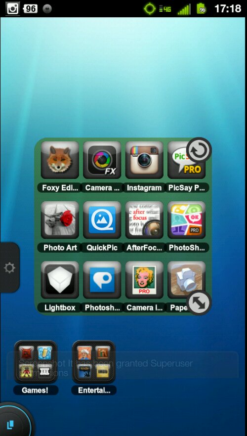
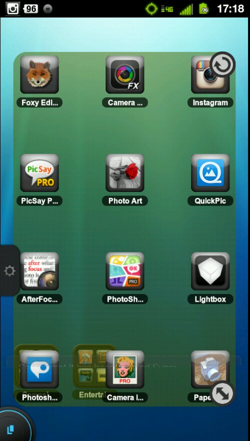
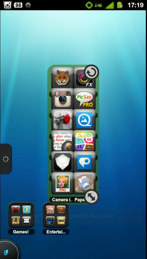 When placing Android Widgets on the home screen it still adheres to a 6×4 grid giving you a lot of space to play with, but goes a step further by allowing you to natively change its density and increase the size of the grid. And don’t forget that app shortcuts and folders can be placed anywhere on the screen regardless of where you put widgets. You can put a shortcut or folder over a widget. TSF Shell 3D also comes with its own set of widgets which are all interactive, very nice to look at, and not terribly functional (more on that later).
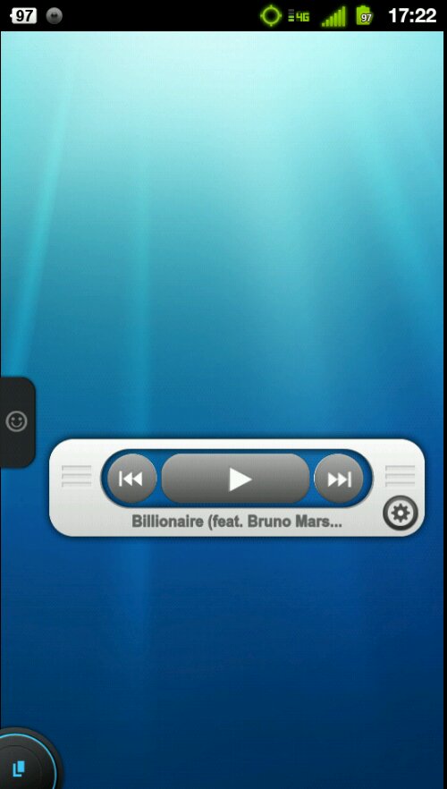
-The TSF Music Widget. When first placed on the home screen looks like a standard widgets with buttons for play/pause, skip forward, skip back, and a gear looking icon to access the Playlist you’re listening to. The secret to this widget is what happens when you perform a downward flick from the Play button. All of a sudden the widget comes to life, going all 3D animation on you and flipping the artwork of the band you’re listening to overhead. Not only that but it allows you to scroll through the artwork by flipping up or down until you get to a song you want to listen to. To diminish the widget, an upwards flick from the Play button transforms it back into the boring widget it was.
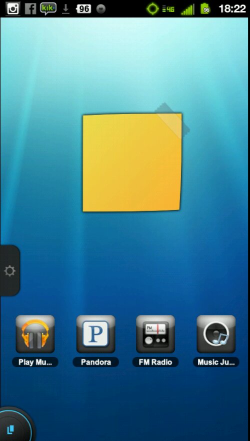
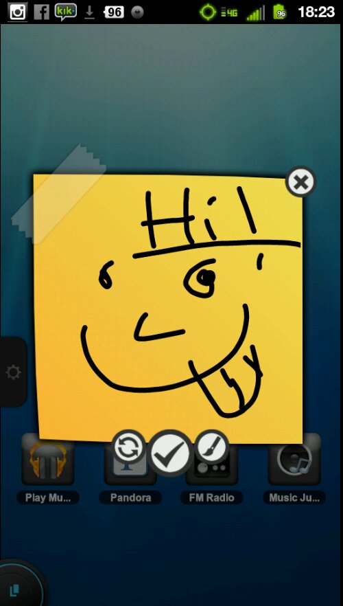
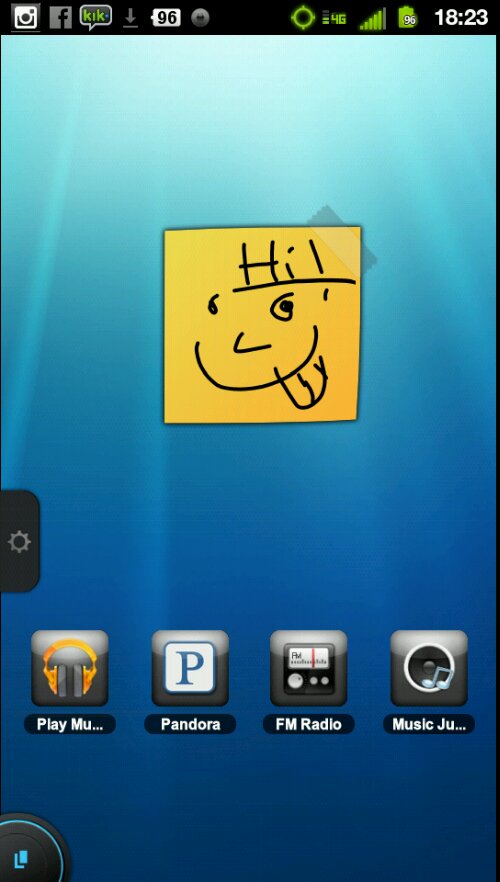
 -The TSF Note Widget. It allows you to place a blank sticky note on your home screen. Tapping on it sends it spiraling into the forefront and then you draw what you want onto it (think draw something style fingerpainting without all the pretty colors). Once your done the note will go back to its diminutive state.
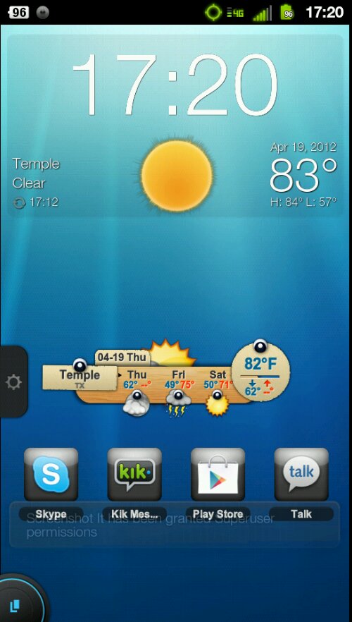
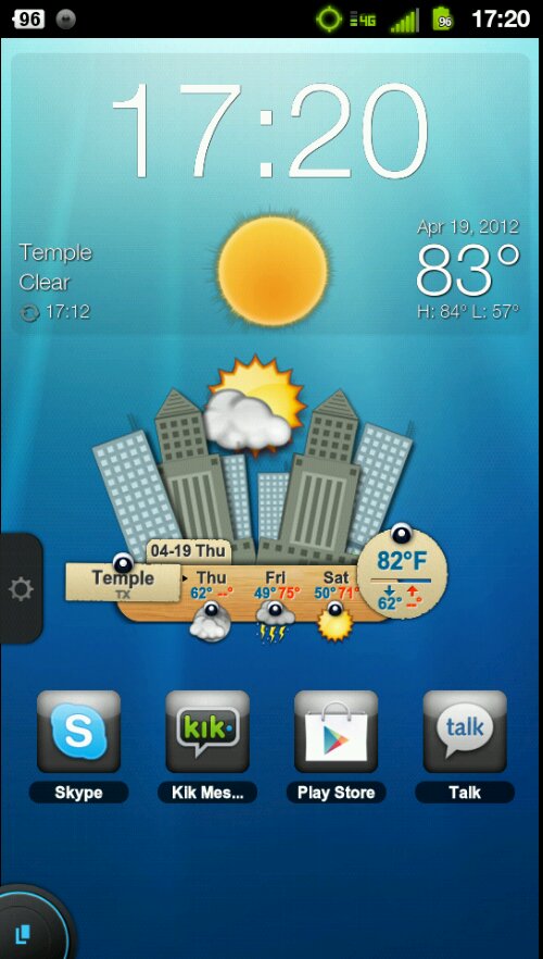
 -The TSF Weather Widget. This widget is basically weather at a glance, which is all most people want in a weather widget in the first place. It shows you a three day forecast, the location you’re in, the current temp, low and high temp, and the date and name of the day it is. All of that in one compact little widget. Tapping the widget brings up an animated pop up book style city with either the sun or the moon behind it depending on the time of day and a cloud.
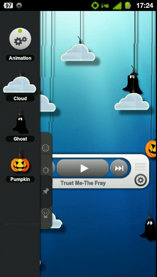
 -Other Homescreen addons. These can’t really be called widgets and they certainly aren’t apps as their purpose is solely decorative. But you can pin things to your Homescreens to give them an added visual flair. As of now there are only three pinnable things with more promised to come, and those are clouds, jack-o-lanterns, and ghosts. These can be animated to move all their own with the push of the Animate button and they will zip along at their own paces. It’s purely decorative. Not functional in any way whatsoever, and in my opinion kind of stupid.
 5th) TSF is also Themeable. Right now there are about 2 to 3 dozen theme in th Play Store and they are pretty basic. But the groundwork has been laid out for theme-ing somewhere in between ADW EX icon themeing and MIUI Style Complete Make Over Themeing. The themes can affect your icons, you’re transitions, the style of your folders, the style of the widgets, the style of style of the dockbar, etc etc.
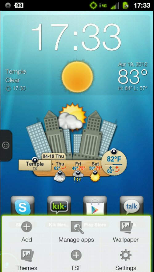
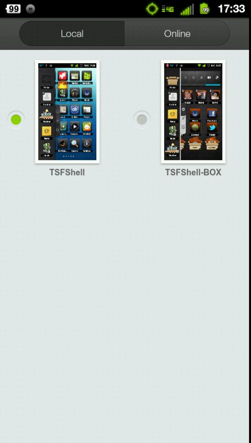
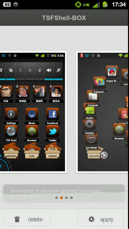 In fact a tiny bit of Icon Customizing in built right into into launcher itself so you can change the look of the little box that surrounds each app or remove it all together.
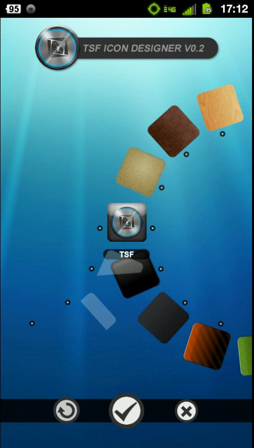 The themes go a bit beyond ADW EX style themes while not quite reaching MIUI themes where as those will also theme the font system wide, the messaging, contact, and dialer apks, the notification bar and the notifications themselves and etc etc. I’m almost frothing at the mouth imagining this layered on top of MIUI.
And now for its Cons:
1st) This is a subjective con as I don’t mind, but there is no app drawer in the traditional sense. Nor is there an option to have one. Instead, as your gliding through your Homescreens you’ll eventually run into your app drawer all the way to the left. Again I don’t mind it much at all, but some people are going to be frustrated by this.
 2nd) The Widgets and Addons are incredibly stupid. This is somewhat subjective, so make you’re own decision. The weather widget is not in any way tied to a dedicated app. So there is no way at all to get a more in depth look at the weather without a separate app like BeWeather or WeatherBuzz. I know that seems like a small thing but consider this: you will have just payed nearly $17 dollars for an app. You want it to have as much included so you don’t have to bog down your device with two pieces of software to accomplish what just one alone could have done. What I mean by this that WeatherBuzz and BeWeather and so many other weather apps come with their own widgets. Sure they’re not fancy and pop up book styled but they are fully functional. And after paying 17 bucks.. I want functional out the yazoo. The Music Widget cannot link with your existing music player. That is a HUGE negative for me. Why? Well in the case of HTC Phones that come with Sense, when you remove the Sense Launcher you remove the Sense Widgets. They are a package deal. So all the play lists you had set up in your HTC Music app won’t show up. Neither will the ones you set up in third party music players like PowerAMP on WinAMP or Google Play Music. In fact all the music Widget does is scan your SD card for audio files and plays them. It doesn’t discriminate or filter between ringtones, songs, or voice recordings. They are all the same.
So when you use that beautiful widget you are giving up all the functionality of your standard music players like filters, equalizer, and play lists. And don’t even get me started on that bogus note Widget or those god forsaken “decorations”. If you are going to be paying darn near $17 bucks for ANYTHING it better be incredibly functional.
3rd) It’s not ICS compliant. This won’t affect terribly many people because ICS isn’t on a whole lot of phone at the moment but if you’re rocking Google’s latest and greatest version of Android you simply cannot use this replacement. Oh, it’ll load just fine, but any items on the dockbar cannot be selected. Widgets can be placed on the home screen but cannot be removed. It becomes one giant mess.
4th) It does not support live wall papers. This is kind of a peeve for me. I don’t actually use live wallpapers very often, but to be stripped of the choice is kind of outrageous. It’s not like it’s a new thing. We’ve had live wallpapers since Android 2.1 for crying out loud. I can forgive not supporting ICS at th moment because it’s still somewhat new. But not supporting a feature that has been out for almost 2 years? Unacceptable.
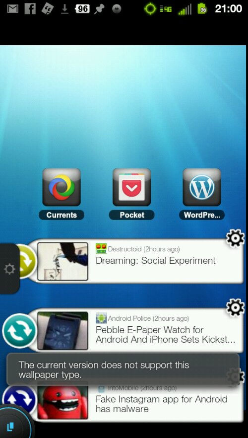 5th) Also does not support scrollable widgets. This goes back to the whole “If I’m paying so darn much I better get all the bells an whistles” side of things. Launcher Pro and ADW EX have supported scrollable widgets for so long now. Why is that not possible with TSF Shell?
6th) While on the whole thing launcher has never crashed on me, or slowed down, I have noticed some strange glitches that are worth mentioning I feel. When selecting multiple apps for moving or arranging, more often than not the last app selected will deselect itself. It’s relatively minor but really annoying. Even more annoying and not quite so minor is this: Certain widgets will disappear from the homescreens upon reboot. PowerAMP is my biggest offender here. Now I’m not sure if this is TSF Shells fault, PowerAMP’s fault, or if the two just don’t like each other but when I have to re-add th sam widget to the same spot the same way I had it when I turned off my phone, something is very wrong. Also when updating apps through the Play Store, sometimes their icon won’t update on the home screen. You will either have to restart the phone or restart TSF Shell in the settings.
7th) Some of the features demoed in the video didn’t make it into the final build. The flags feature is notably absent. The TSF store is not available. Granted seeing features being to see around an planned on and pulled before launch isn’t new, but, again, at this asking price.. They should have been there.
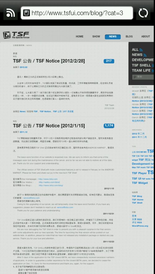
8th) The website is mainly in chinese. Getting support for the app at its website is impossible unless you understand the language the page is in. Also there are no forums or anything of that nature.
 So my take on this launcher is as follows. Is it worth $16.80 of your money? As it stands right now, most likely not. While TSF does do a few things very right, for the price it charges it should be doing four times as many things right. Widgets should be scrollable. Live Wallpapers should be interested option. Widgets should survive reboots. The time spent on decorations should have been spent on making TSF Shell 3D specific widgets more functional an on adding more of those widgets in the first place. Features that should have been there, aren’t. That doesn’t mean that it’s a lost cause though. This app is still very much in its early stages an development is very active. I expect many good things from this launcher. Many many good thing indeed.
If I had to rate it I would give it 3 out of five stars. This ladies an gentleman is one to keep your eyes on cause it will only get better over time. Now if your current launcher is feeling stale, or if you’re getting bored of your phone during the wait for ICS, or if you watch that YouTube Video and feel that Techno-Lust itch rising and you do buckle down and shell out for it you may not want to go back. It offer a very unique experience. And honestly it has tremendous potential. You can find it in the Google Play Store.


 April 20th, 2012
  Gene
Gene  Posted in
  Tags:
Tags: 


